business
How to Start a Business in Liverpool: A Practical Step-by-Step Guide
Thinking of starting a business in Liverpool? This guide covers the 12 steps that matter — from testing your idea to getting your first paying customer.
Brian10 min read
In 2025, if your Merseyside business website isn't mobile-optimized, you're losing customers. Discover why mobile-first design is a local business necessity.

In 2025, if your Merseyside business website isn’t optimized for mobile devices, you’re not just losing customers,you’re actively pushing them toward your competitors. With mobile devices accounting for over 60% of all UK web traffic, mobile-first design has shifted from a nice-to-have feature to an absolute business necessity.
For Liverpool and Merseyside businesses competing in an increasingly digital marketplace, understanding and implementing mobile-first web design principles isn’t optional anymore. It’s the difference between thriving and merely surviving in today’s mobile-dominated landscape.

The numbers tell a compelling story that no business owner can afford to ignore:
Mobile-first design represents a fundamental shift in how websites are conceived and built. Rather than designing a full-featured desktop website and squeezing it into smaller screens, mobile-first design starts with the mobile experience and progressively enhances it for larger displays.
While responsive design ensures your site geometrically works on mobile devices (by shrinking columns and images desktop-down), it often results in bloated code and compromised mobile performance.
Mobile-first design inverts this approach. You start by designing for the smallest screen and most constrained environment first, then progressively add features and complexity for larger screens. This approach forces you to prioritize content and functionality, resulting in faster load times, cleaner code, and far better user experiences.
Liverpool and the wider Merseyside region have experienced remarkable digital transformation. From the thriving Baltic Triangle tech scene to established businesses across Wirral, Sefton, and Knowsley, local companies face unique opportunities and challenges in the mobile era.
Merseyside’s vibrant tourism industry, bustling retail sector, and professional services depend heavily on mobile discovery. When visitors search for “restaurants near Liverpool ONE” or “accountants in Wirral,” they’re overwhelmingly doing so on their phones while on the go.
A mobile-first website ensures you’re not just found,you’re chosen. Fast loading times, clear navigation, and easy-to-use contact features mean the difference between a search result and a customer walking through your door.
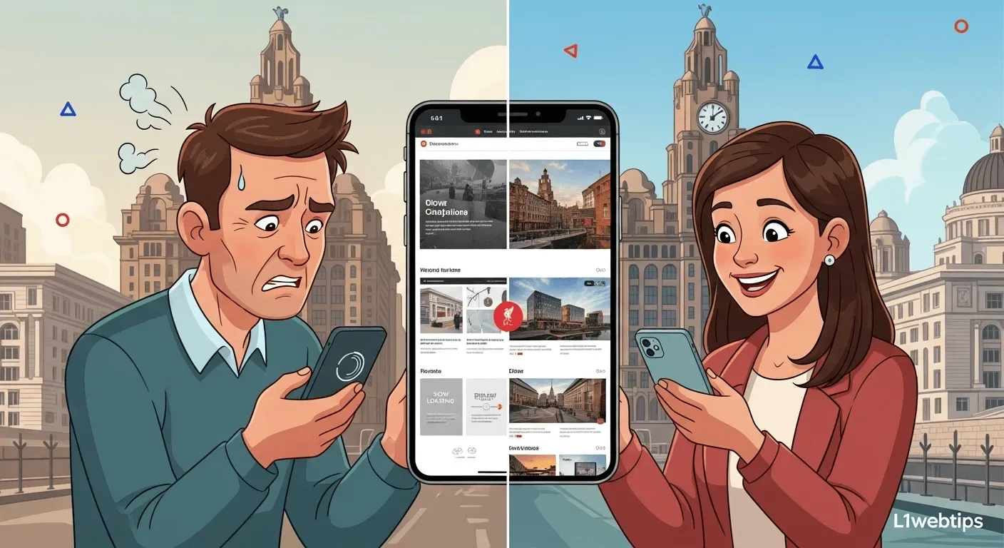
Consider a potential customer comparing three businesses on their smartphone while waiting for a train at Lime Street Station. The one with the fastest, clearest mobile experience typically wins,regardless of who objectively offers the best offline service.
Your website is often the first impression customers have of your business. Research shows that 57% of users won’t recommend a business with a poorly designed mobile site. A clunky, slow mobile site communicates that your business is outdated, unprofessional, or doesn’t care about customer experience.
Implementing mobile-first design successfully requires understanding and applying several core principles:
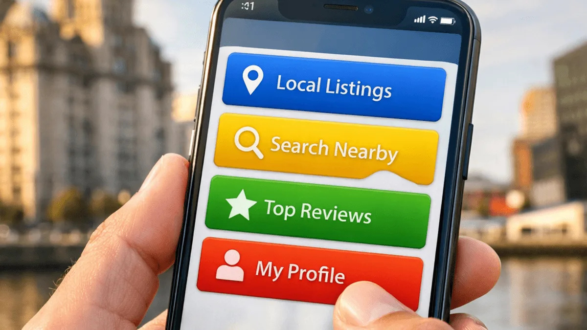
Mobile screens force you to show only what matters. Identify the most critical actions for your users and present them prominently. For a Merseyside estate agent, this means prominently displaying property search and phone contact on mobile, while long company history pages take a back seat.
Mobile-first means performance-first. Target page load times of under two seconds on 4G connections. Key strategies include:
Fingers are less precise than mouse pointers. You need:
Desktop navigation patterns (like massive hover menus) fail on mobile. Prioritize the most important sections, use clear labels, and consider context-specific features like prominent “click to call” buttons or integrated maps with one-tap directions.

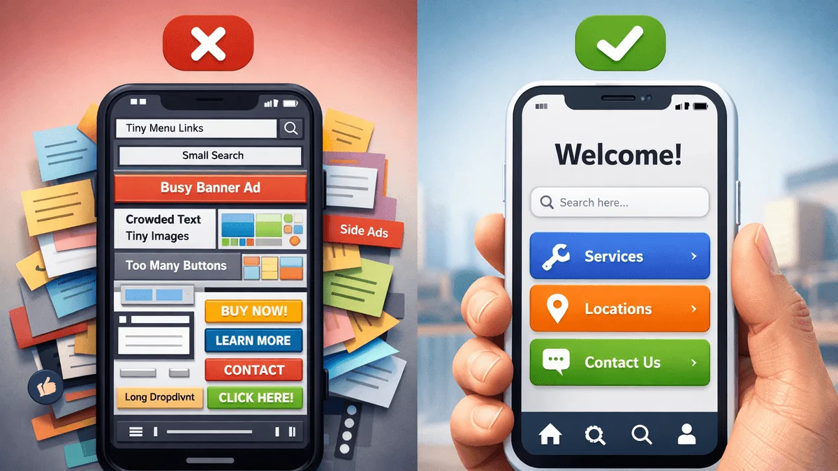
We review a lot of local business websites. Here are the most frequent, easily fixable conversion killers we see time and time again:
If you run a restaurant on Bold Street or a cafe in Waterloo, forcing a mobile user to download a 2MB PDF to read your menu is a fantastic way to lose a booking. Mobile users want immediate, on-page text that they can easily scroll through without pinch-and-zooming.
Plumbers, electricians, and roofers often cram their phone numbers or 'Get a Quote' buttons into tiny header bars. If a user in an emergency (like a burst pipe) can't easily tap your phone number with their thumb while holding their phone with one hand, they will bounce to the next result.
Users performing local searches are often already out and about, looking for directions or an immediate answer. If your Liverpool address or Google Map embed is buried on a difficult-to-find 'About' page instead of the footer or a dedicated, easy-to-tap 'Contact' button, you're creating friction.
If your current website wasn’t built with mobile-first principles, transitioning requires strategic planning. Here’s a roadmap for Merseyside businesses:
For Merseyside businesses, mobile-first design isn’t about preparing for the future,it’s about competing effectively in the present. With mobile devices dominating web traffic and user expectations constantly rising, the question isn’t whether to embrace mobile-first design, but how quickly you can implement it.
The competitive advantage goes to businesses that act decisively. A mobile-first website doesn’t just serve mobile users better,it improves the experience for all users through its focus on speed, simplicity, and user-centered design.
Remember: Every day your website isn’t optimized for mobile is a day you’re losing customers.
Q: How much does it cost to make my existing site mobile-first?
Often, it's more cost-effective to rebuild the front end entirely rather than untangling years of old "desktop-first" code. A clean, mobile-optimized rebuild can significantly boost your SEO and conversion rates.
Q: Will a mobile-first design look bad on a desktop computer in an office?
Not at all. "Mobile-first" doesn't mean "mobile-only." It simply means the core structure is designed for the most constrained environment first. The site then progressively enhances, expanding beautifully to fill larger desktop screens without unnecessary bloat.
Q: I have an app, do I still need a mobile-first website?
Absolutely. An app is for retention (keeping existing loyal customers engaged). A mobile-first website is for acquisition (getting found on Google by people who don't know you yet). Users won't download an app just to check your opening hours.
L1 Web Tips specializes in creating fast, user-friendly, mobile-first websites for Liverpool and Merseyside businesses. We understand the local market, your customers’ needs, and the technical requirements for success in mobile search.
Our mobile-first approach ensures your website doesn’t just work on mobile devices,it excels, providing the fast, intuitive experience that converts visitors into customers.
Contact us today for a comprehensive mobile performance audit and discover how mobile-first design can transform your online presence and drive real business results.
Get help
We help Liverpool businesses with web design, SEO, and content. Honest work, fixed prices.
More articles
Thinking of starting a business in Liverpool? This guide covers the 12 steps that matter — from testing your idea to getting your first paying customer.
Discover why Astro 6.0 is a game-changer for Liverpool businesses, offering lightning-fast speeds and better security for your local website.
Is your site losing leads? Discover 7 common issues with Liverpool mobile-friendly websites that most business owners miss on their own phones.